Form Settings:
 Form settings
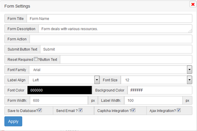
 tab allows you to edit form title,description of form, form action, submit button text, reset button text, label alignment, options are database storage, send email, captcha integration, ajax integration. Database storage code generated only after checked the save to database option. Like wise send Email, captcha integration. if you want to save data asynchorously i.e.,AJAX then Ajax Integration option should be checked.
Icon:
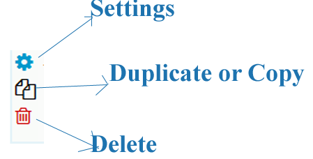 Click on Settings icon ,a popup window appears with element settings. Click on the apply button save current element settings temporarily.
Clicking on the Duplicate icon copy the element including settings.
Clicking on the Delete icon delete the element including settings immediately without prompt queries.
Select Form Colors button list the available color themes. After select one press ok. if you are not select default themes will be available.
Maximum 25 form elements can be added. After finished form elements click on the Generate Form Integration Code Button generate codes as per your selection.
Drag and Drop:
Drag and Drop of elements available in our form builder. Hold left click above the field element except icon area, move it by holding left click and drop on new position. By this way you can reorder all elements.
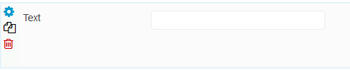
Form Elements: Text Box
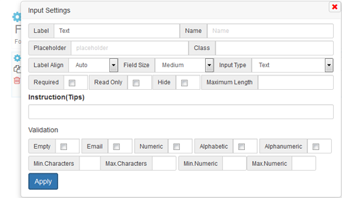
Text Box settings allows you to enter label, text box name, placeholder, class, label alignment, tips. Textbox name is auto generated, but additional name as suffix can be added using Name field. Field size are small, medium, large. Required checkbox validate the field exist or not before form data submission. Tips can be shown beside label on mouse over. Text Box can be validated using client side Javascript on form submission. Validation such as empty, email, numeric, alphabetic, alphanumeric, minimum characters, maximum characters, minimum numeric, maximum numeric are generated if you tag it. By this input text field name, age, numeric field, email can be generated.
Textarea/Paragraph settings:
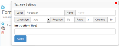 Textarea settings allows all to enter label, name, label alignment, rows, columns,tips. Label settings displays label text beside textarea. Required checkbox validate the field exist or not before form data submission. Tips can be shown beside label on mouse over.
Checkbox Settings
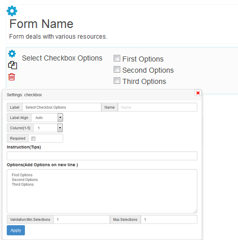
By clicking checkbox menu on the left panel, list of default checkboxes appear on the right panel. Settings icon allows to change the default options, label, check box field name, label alignment,tips, options name and value. column selection enable to display column wise if more checkboxes available. Minimum selections and maximum selections validate the check boxes. Minimum selections require the user to select atleast minimum number of checkboxes. Maximum selections require the user should not go beyond maximum checkboxes.
Multiple Choices(Radio Button) :
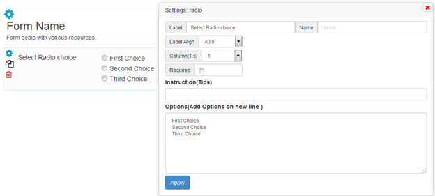 By default radio button choices appear. Settings icon help you to change the default option value, radion button label, Name, label alignment, column, tips. Required selection validate the user to pick one choice.
Dropdown [Select]
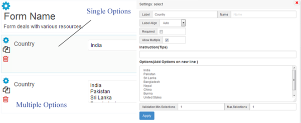 Drop down allows users to select one option from the list. Allow multiple option on settings lead to multiple selection. Settings icon allows you to change Label, Name, Label alignment, Tips, Options, Minimum selection and Maximum selection.
Upload File:
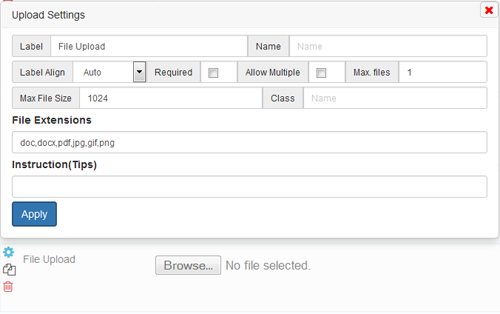 Upload field allows user to upload file to your server. Label, Name, Label alignment, Required, File Extensions, Tips available in upload settings to change. Allow multiple, max.Files, Maximum file size not available now. We will update later.
Date:
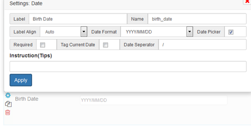 Date menu on left panel menu displays the date field including settings. Settings allow you to change the label, name, label align, date format. Select any one of 3 date format available. jQuery Date picker available to user when focus on the field if you checked the date picker. Current date will be displayed to the user depends upon the date format if you checked the Tag Current Date. Day, month and year are seperated by seperator. By default “/” will be displayed. You can change any seperator. Tips available to users beside label.
Time:
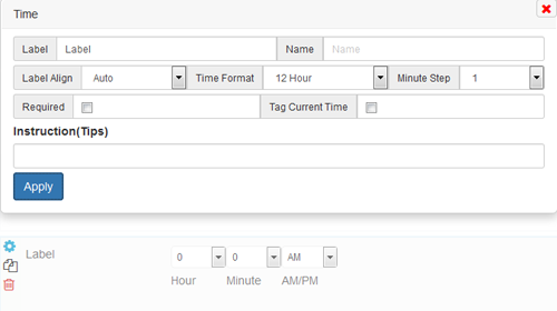 Time field displays on the right panel when time menu of left panel clicked. Time settings allows you to set right format in form. Select any of Time format 12 hour, 24 hour. 24 hour setting shows 0 to 23 hour and hides the meridian (AM/ PM). Minute step available as 1, 5,10, 15, 30. Tag current time not working properly. we will update later. Label, Name, Tips are available to you in time settings popup to change.
Full Name:
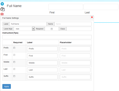 Full name display first and last field to user by default. You can opt to add prefix, middle, Suffix. Required checkbox validate all field in the full name.
Address:
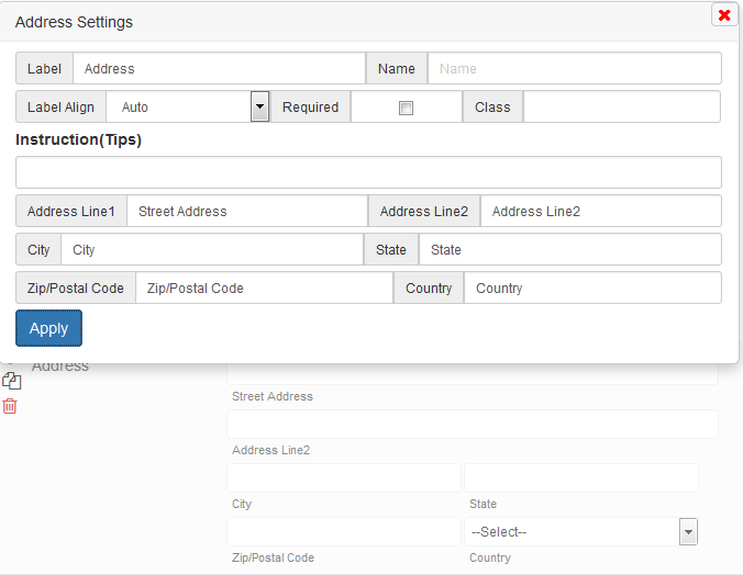 Universal address field such as Address line1, Address Line 2, City, State, Zip/Postal Code, Country are displayed to your user if you add it to your form. Each address field label can able to be change . Label, Name, Label Alignment, required, Tips allowed to change the address settings.
Phone:
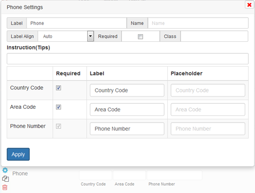 Phone field available to your user if you add it to your form. Country code and Area code are optional. Label and place holder for country code, area code, phone number available to change. Required field validate all displayed phone fields. Tips available to your user beside label on mouseover.